Fragmented patterns
The same interactions were designed differently across teams and products.
Hillrom · Design System · 2021
I helped move Hillrom from fragmented product patterns and disconnected design tools toward a scalable Figma system that designers could build with—and actually wanted to use.
01
Hillrom teams were solving the same UI problems independently. Similar patterns looked and behaved differently across products, and designers spent time making low-value visual decisions that should have been solved once.
There was no shared source of truth, which made consistency difficult to maintain as the portfolio grew.
The same interactions were designed differently across teams and products.
Teams repeatedly rebuilt foundational UI instead of focusing on harder product problems.
Sketch and Axure workflows made reuse, maintenance and consistency difficult at scale.
02
A component library only creates value when teams trust it enough to use it. Instead of designing the system in isolation and handing it over, I built it with the people who would depend on it.
That meant auditing what already existed, studying mature systems, workshopping decisions with cross-functional partners, and documenting not only what a component looked like—but when to use it.
Collected patterns across legacy products to identify overlap, inconsistency and repeated solutions.
Studied systems like Carbon, Fluent and Atlassian to understand the decisions behind them.
Reviewed components with designers, PMs and engineers so adoption started before launch.
Created living guidance for usage, behavior and edge cases—not just visual specs.
03
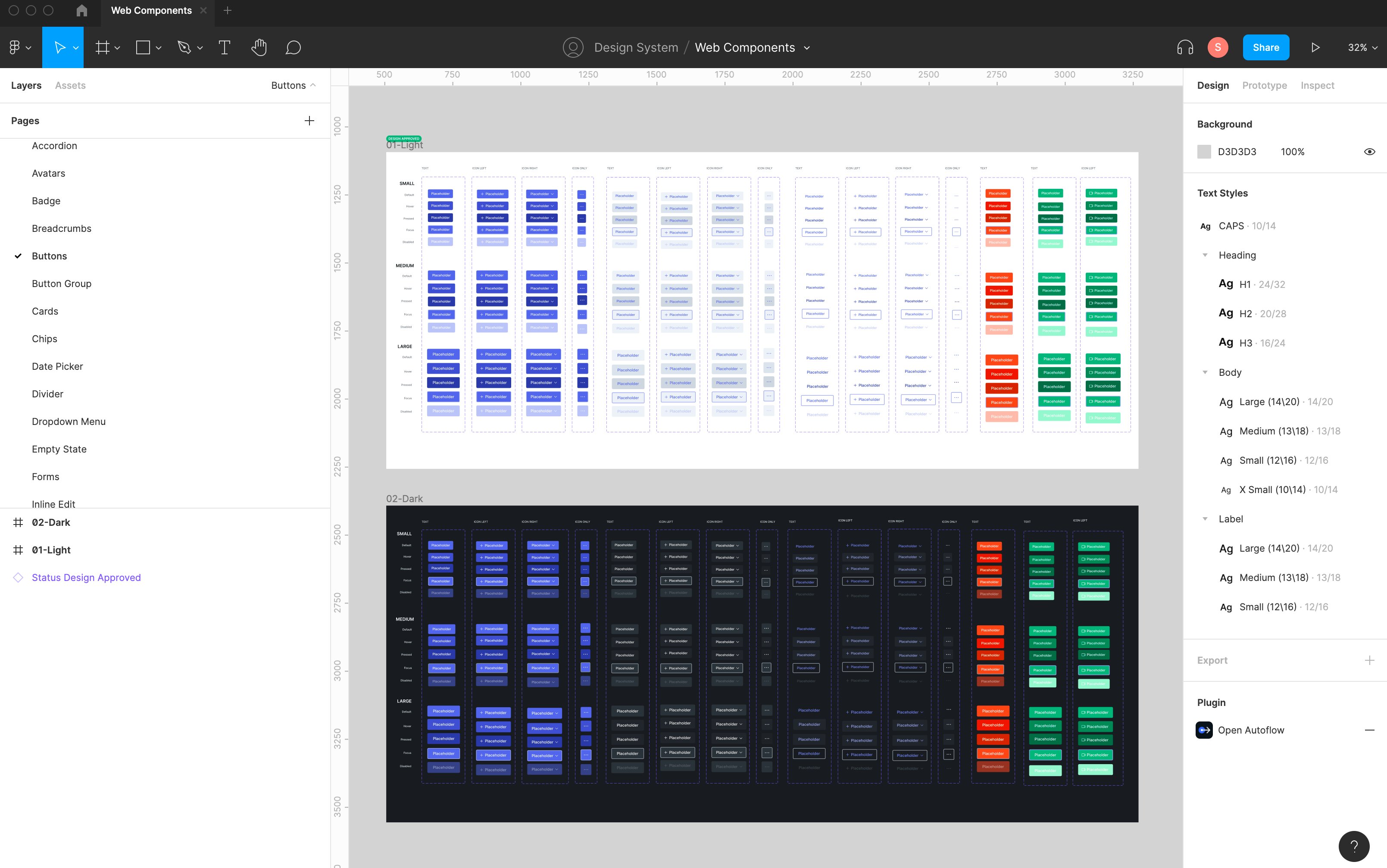
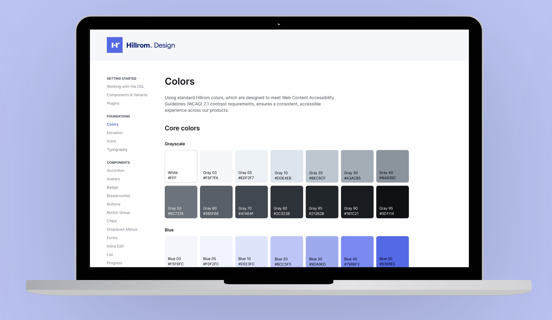
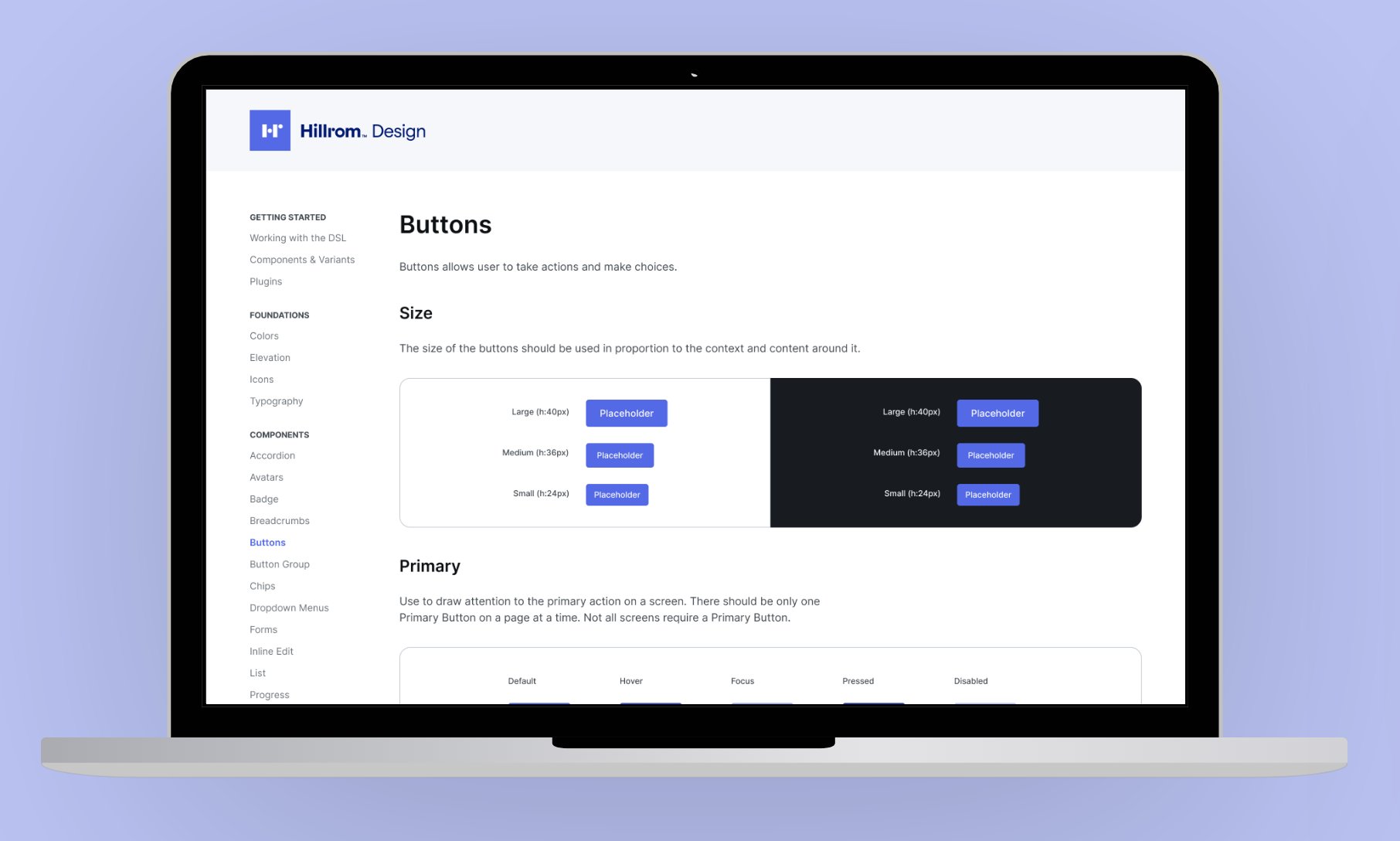
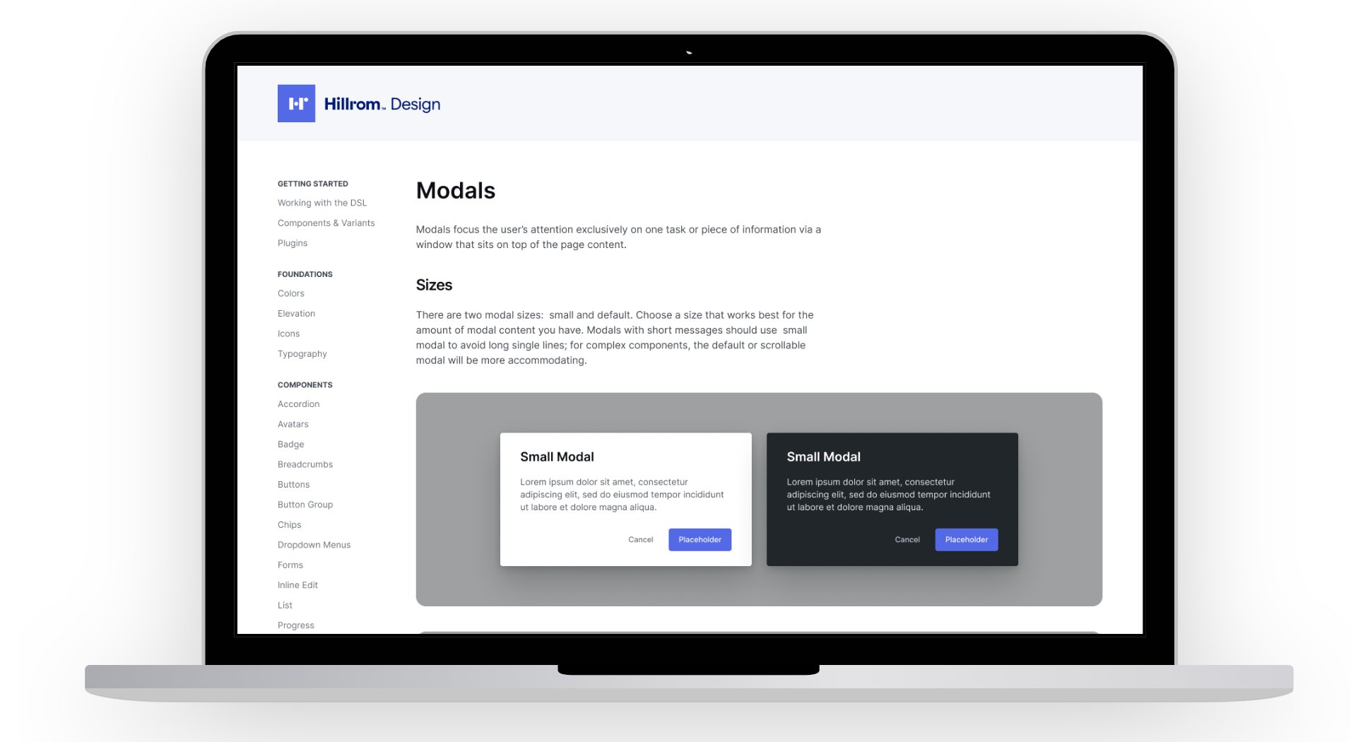
The system brought together color, typography and foundational tokens with reusable components for the realities of Hillrom products—from clinical interfaces to administrative tools.
Density, legibility and interaction states mattered because these components had to work across very different contexts while still feeling like one product family.
04
The goal was to change how teams worked, not simply create a polished component inventory. Figma became a shared environment where product teams could start from aligned patterns and spend more time on the unique problems in front of them.
The longer-term direction was a cross-functional system connecting design, engineering and product around the same language.
Teams could design from the same reusable components instead of rebuilding patterns project by project.
Shared decisions reduced visual drift across Hillrom's broader product ecosystem.
The foundation could grow into a system shared across design, engineering and product.
05
The component library mattered, but the bigger win was creating something teams actually used. Building with people rather than for them made the system feel shared from the beginning.
Next case study · Voalte Family →